The psychology of color in graphic design refers to the study of how different colors evoke specific emotional and psychological responses in viewers. Colors have the power to influence our emotions, perceptions, and even behavior, making them a vital tool in graphic design to create impactful and meaningful visual communication.Here are some commonly associated emotions and psychological responses to various colors:
Red
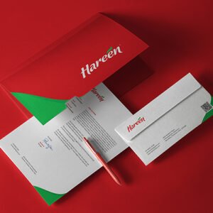
Red is often associated with energy, passion, and excitement. It can also convey a sense of urgency or danger. Red can stimulate appetite and create a sense of urgency, making it suitable for food and retail industries.
Blue
Yellow
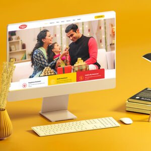
Yellow is associated with happiness, optimism, and warmth. It can grab attention and create a sense of cheerfulness. Yellow is often used in branding related to youthfulness, creativity, and fun.
Green
Purple
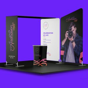
Purple is often associated with luxury, royalty, and creativity. It can evoke a sense of mystery, sophistication, and spirituality. Purple is frequently used in beauty, fashion, and artistic industries.
Orange
Orange combines the energy of red and the cheerfulness of yellow. It represents enthusiasm, warmth, and excitement. Orange is often used to grab attention and create a sense of vitality and friendliness.
Pink
Pink is often associated with femininity, tenderness, and romance. It can evoke feelings of playfulness, sweetness, and nurturing. Pink is commonly used in industries related to beauty, fashion, and products targeting women.
When creating visual designs, graphic designers often consider color theory and the desired emotional response to effectively communicate a message. They utilize color combinations, contrast, saturation, and other design principles to create harmonious and emotionally impactful designs that resonate with the intended audience.


